background
Feather River Land Trust is a nonprofit in Northern California working to conserve one of the state’s largest watersheds.
So much has changed since FRLT launched their previous website in 2012—the scale and impact of their conservation work has doubled, and the organization and the support they needed to accomplish their goals have, too. Additionally, web design has evolved dramatically and FRLT needed a responsive website and a new strategy for engaging visitors.
Before launching into designing the new site, FRLT recognized they first needed to learn more about their target audiences. So we spent six months on user research before moving into copywriting and UX design. I also refreshed their logo and visual identity.
scope
- Stakeholder interviews
- Online surveys
- User group development
- Personas
- Competitive analysis
- Content audit
- Core modeling
- Card sorting
- Wireframes + prototypes
- Web development
- SEO templates + training
- WordPress guide + training
specs
- Custom WordPress site
- Built in 2020
We wanted a beautiful website to showcase the importance of our watershed and the impact of conserving it. Carrie delivered—above and beyond! Additionally, the skills we learned from her during the user research and content strategy phases of the redesign process continue to inform our outreach communications every day.
—Katie Bagby, Donor Relations & Communications Specialist
highlights
content driven by user research
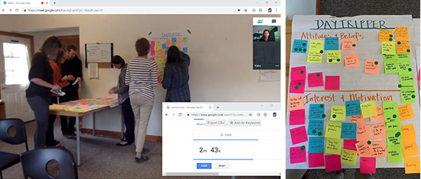
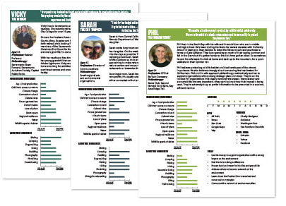
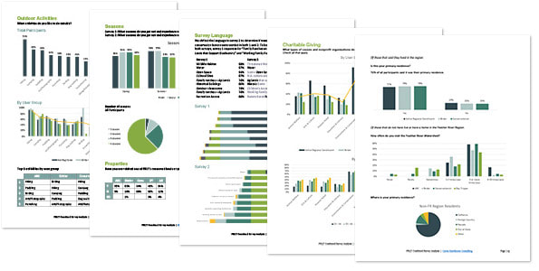
FRLT’s primary goals in building a new website were to increase the public understanding of the nonprofit’s impact in the region and raise awareness of the importance of the Feather River Watershed. In order to accomplish this, we needed to first to identify and learn about FRLT’s target audiences. We did this through a multi-pronged research approach:
- Focus group and interviews with key stakeholders
- Two online surveys reaching 300+ respondents
- Interviews with representatives from target audiences
- Personas of our target audiences to ensure a user-centered design
demonstrating value of the watershed
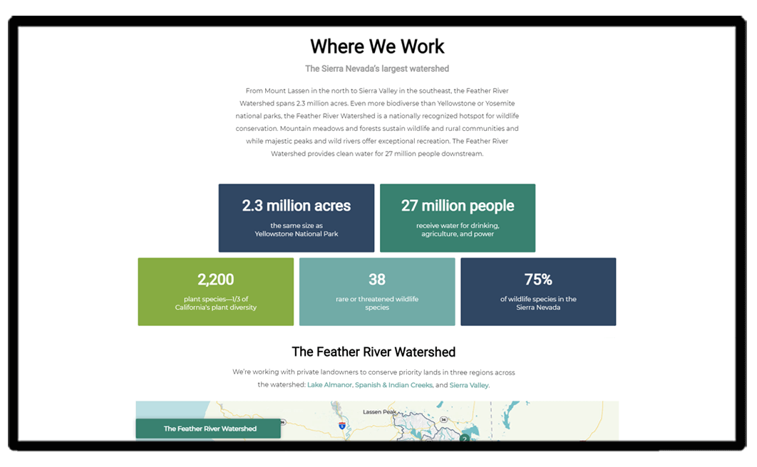
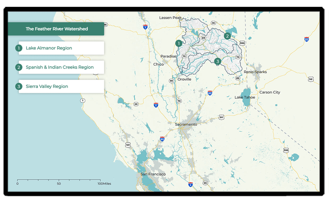
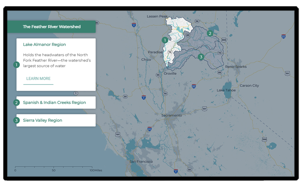
We incorporated infographics that offer a snapshot of the watershed’s importance. An interactive map focuses on hydrology and shows the watershed in the context of the state—to help out-of-area audiences (donors) understand the value of the region and the need to prioritize and fund conservation.
conveying impact on a regional level
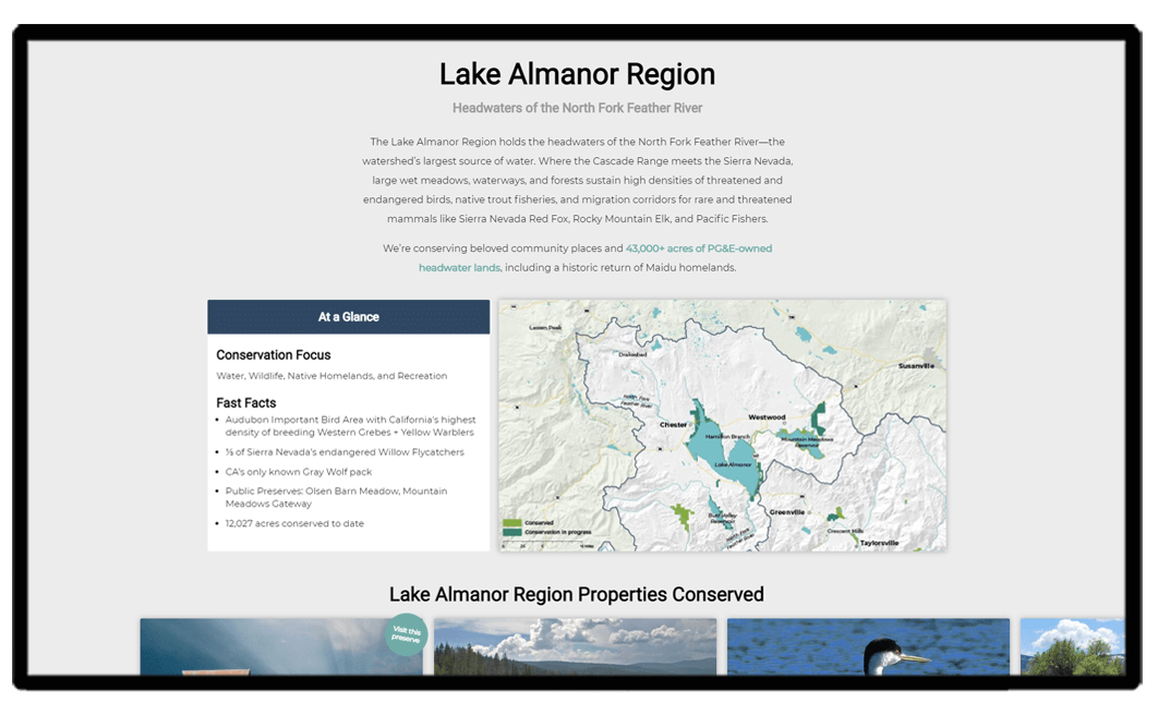
Since the watershed is massive (2.3 million acres), we broke it into three regions in order to highlight the conservation features specific to each area, to underscore their value, and to showcase the properties conserved in each region. These regions happen to align with FRLT’s target audiences’ interests, too.
engaging new audiences
In addition to protecting the land, FRLT also works to restore people’s relationship with the land. So FRLT’s website aimed to get local folks out to visit their public preserves while also capturing day trippers from Reno and Chico—the closest cities to the watershed.
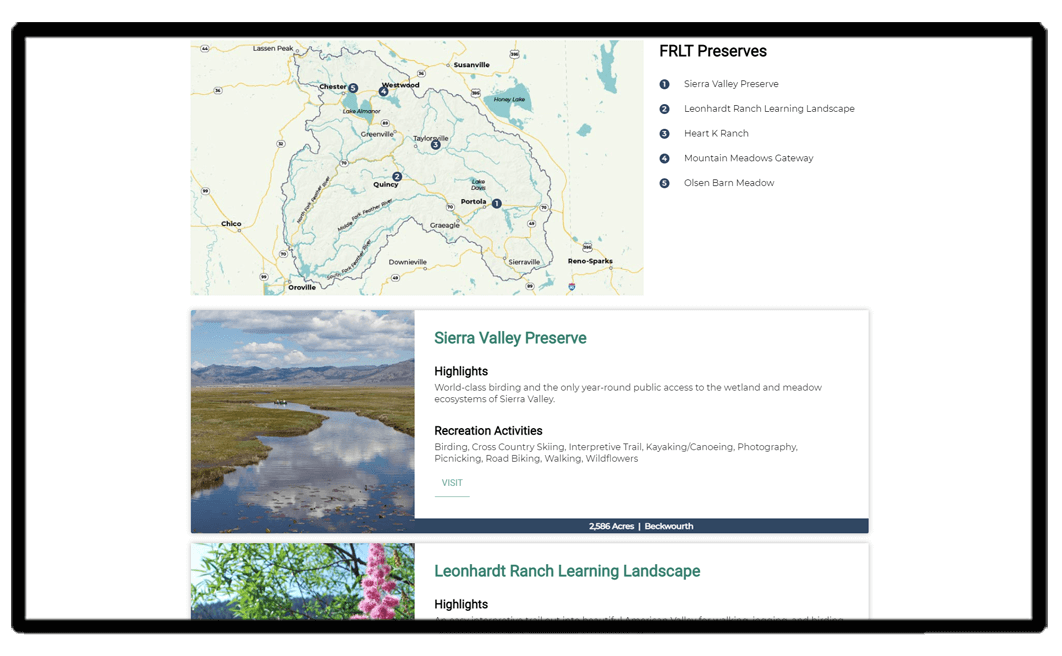
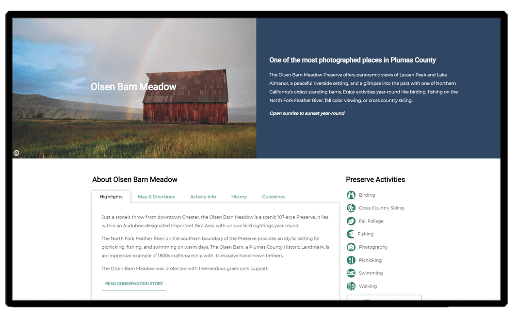
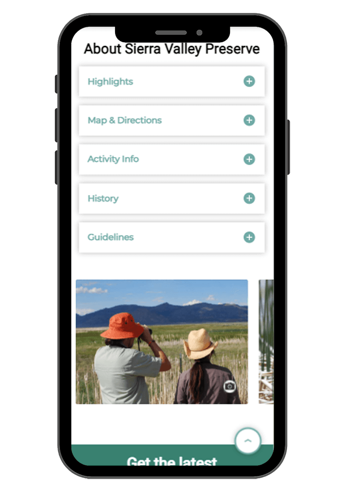
We featured an interactive map with the 5 preserves on the Get Outside page for visitors to easily identify the preserve locations. Each public preserve has a dedicated page with seasonal activities, best times of the year to visit, downloadable preserve maps, photos, and visitation guidelines.
converting visitors
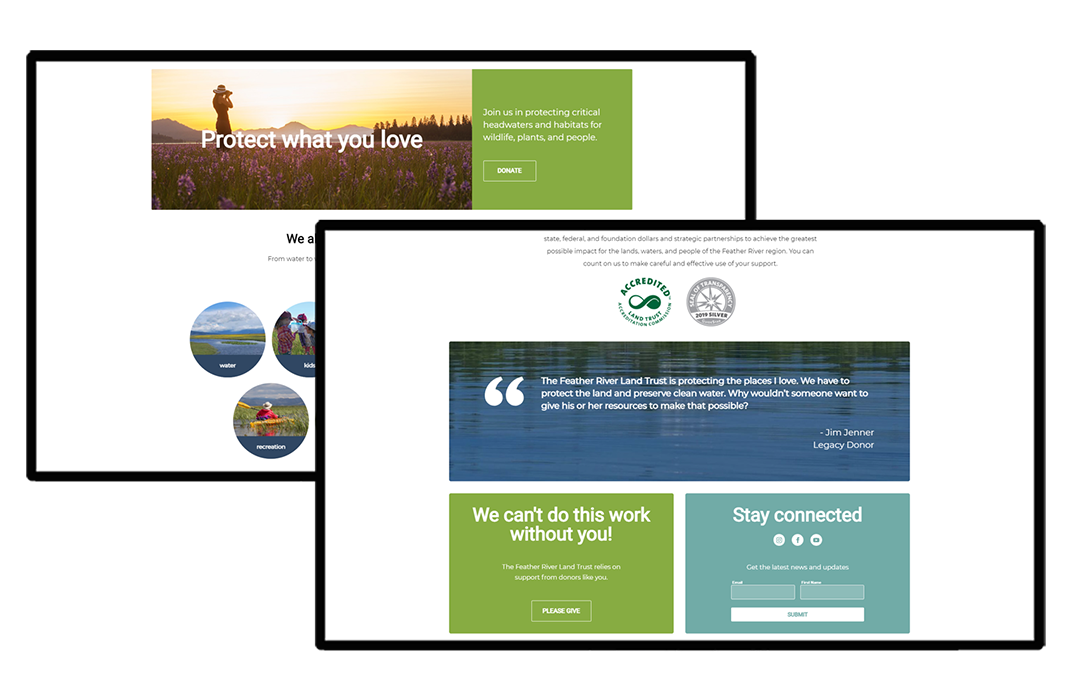
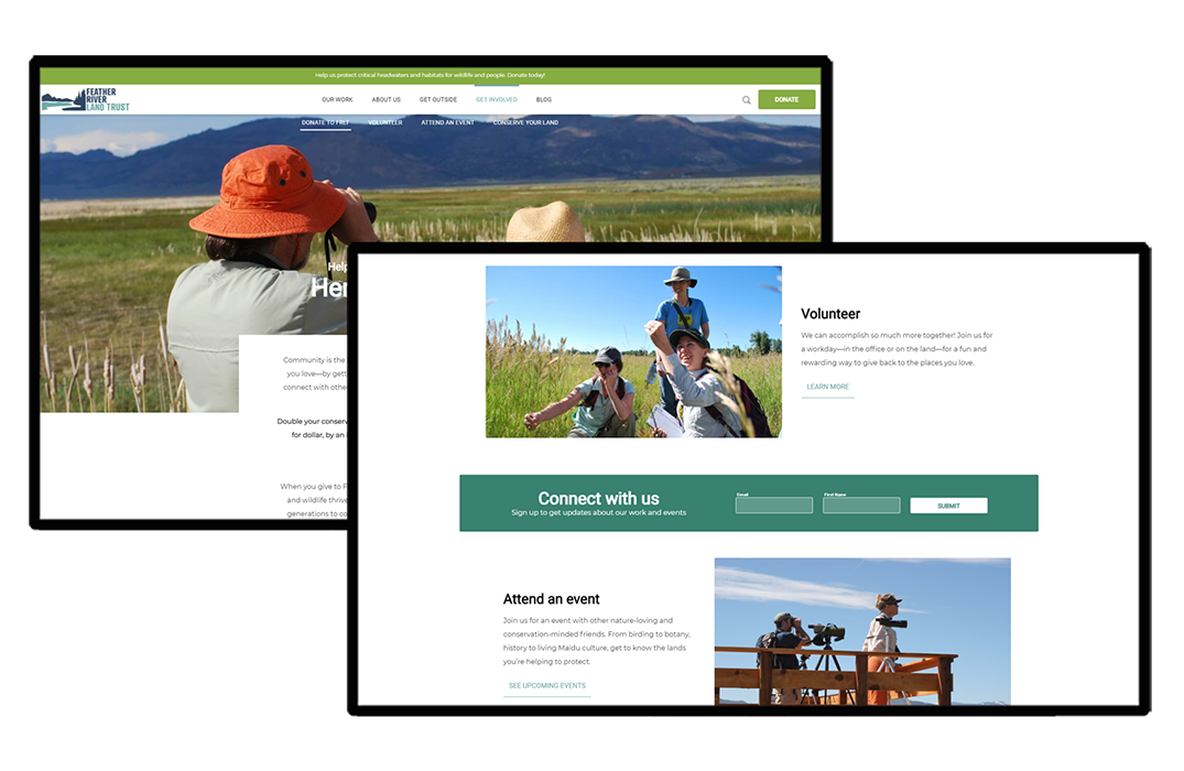
We created clear, customized calls to action on every page to encourage users to learn more, subscribe and donate. The light green is used across the website for all donation-related content, and teal and light blue are used for volunteering and connecting.
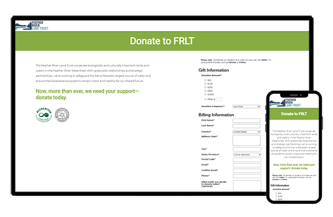
We designed an editable banner (content, color and URL) at the top of the site for FRLT to use when running fundraising campaigns. And lastly we customized the donate page as best we could within the confines of Razor’s Edge embed form (owned by Blackbaud—the worst fundraising software on the market).
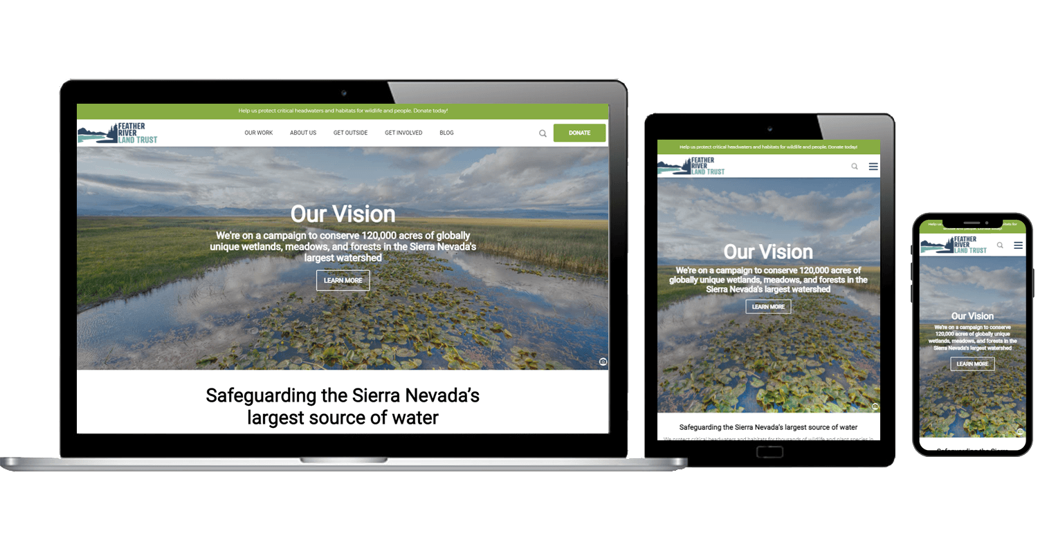
optimized for mobile
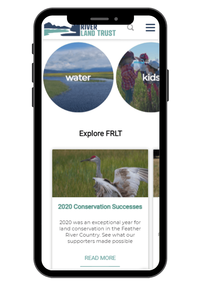
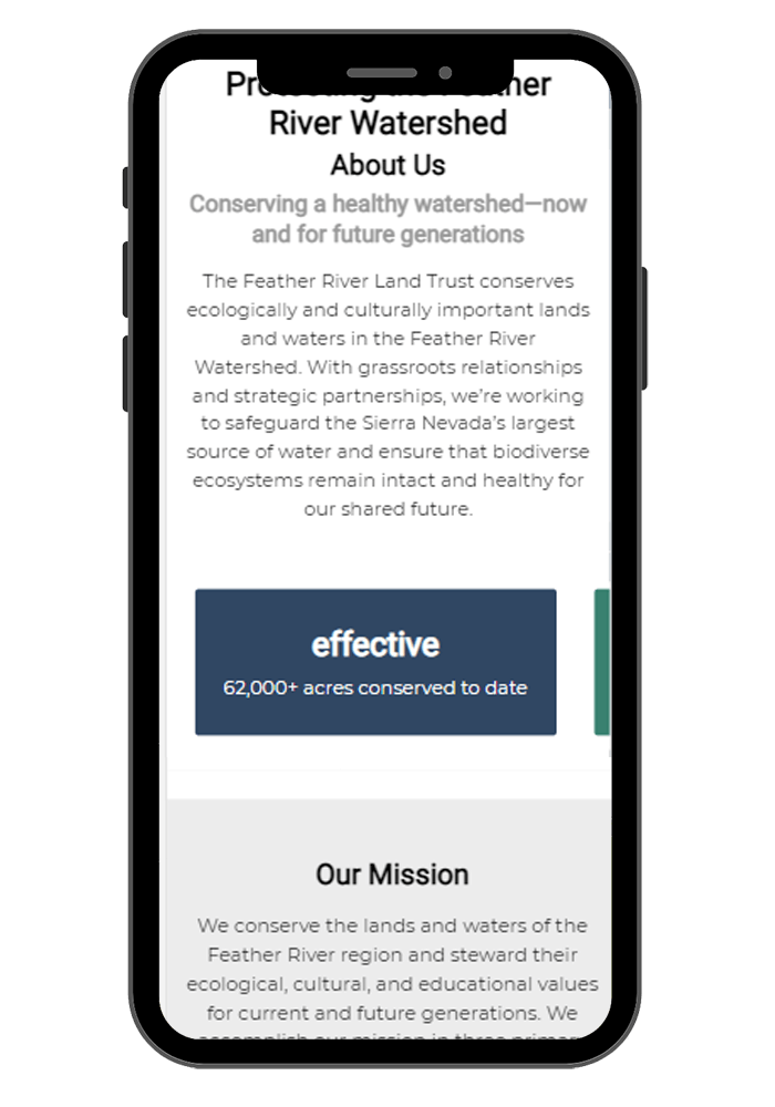
As with all websites I design, the mobile experience is an important part of the design process. We incorporated horizontal swiping on infographics, blog and preserves cards, and condensed many elements to save important vertical real estate.
Our new website is beautiful! The process Carrie created for us helped our team clarify who we're communicating with and how to prioritize our content. It's become an incredibly important asset for helping us accomplish our mission.
—Vanessa Vasquez, Program Coordinator

