background
Feather River Land Trust protects critical headwaters and habitats for thousands of wildlife and plant species in the Feather River Watershed in Northern California.
Before we embarked on a multi-year user research and web design project, they hired me first to redesign their logo and modernize the organization’s visual identity.
scope
- Logo redesign
- Visual identity
- Maps
- Iconography
Carrie was wonderful at guiding our team through the design process. She helped us define a vision for our branding that really represents us, and delivered a beautiful refresh of our logo and color palette that honors the spirit of our original identity, while giving it a brighter and bolder look that pops both online and in print.
—Corey Pargee, Development Director
visual identity
logo refresh
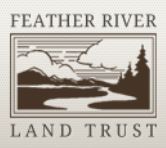
A talented local artist designed FRLT’s logo over 20 years ago but the organization didn’t ever attain a cohesive visual identity, with colors and various logo versions used over the years.
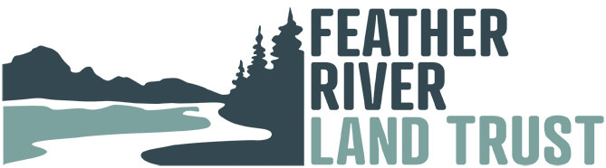
I stripped down the logo and selected the font Atrament which reminded me of retro park signage.
old logo versions
new logo

color palette
The natural beauty of the Sierra Nevada mountains was the inspiration for the new color palette. However, once I began to design the website, some of the colors looked too muted. I brightened all but the green grass color for a more lively, warmer look.
new color palette

web-adapted color palette

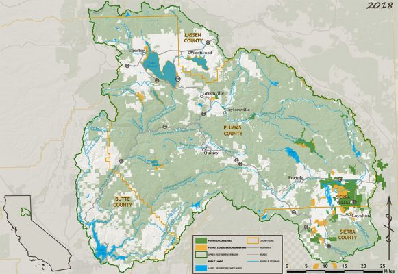
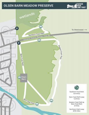
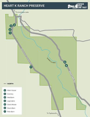
maps
Maps are important for land trusts and conservation organizations to convey the impact of their work. Prior to commissioning me to design maps, FRLT tended to use GIS software to produce all of their maps. I worked with their geographer to develop accurate, more user-friendly maps that fit into their new color palette.
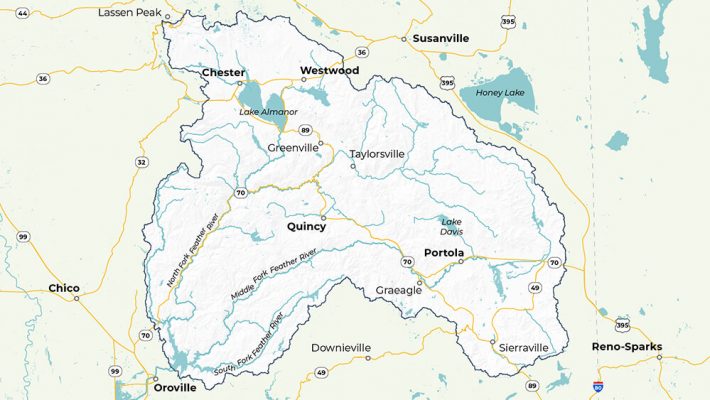
watershed map
FRLT works in an extremely remote region in Northern California. Since many of FRLT’s supporters are from out of the region, I wanted to add points of context like cities (Reno + Chico), highways (395 and 80) and tourist destinations (Lassen Peak) to help viewers more clearly identify the region. I also simplified map features and removed unnecessary elements.
watershed map before
watershed map after
preserves maps
I redesigned the maps for FRLT’s 5 public preserves to be easier for “non-map” people to use and explore the land. I intentionally selected portrait orientation for all preserves’ maps so users can more easily view once they download to their phones.
preserves maps before

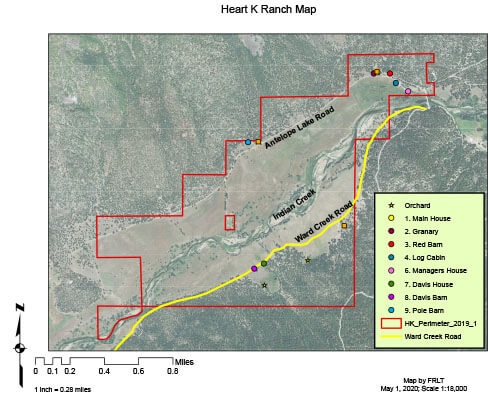
preserves maps after
It's rare to work with a really good designer who has such good marketing instincts and knowledge and also understands nonprofits. Plus, of course, she's smart and fun and fast and professional.
—Katie Bagby, Donor Relations & Communications Specialist