background
City Forest Credits is a nonprofit that helps the private sector contribute to local climate action and enrich communities through carbon offsets and tree planting projects in urban areas.
CFC is a young organization poised for growth. They recognized the need to move away from their homegrown look to a more polished look that resonates with their corporate clients. I created a new logo and and visual identity to begin building a cohesive brand before I redesigned their website.
scope
- Logo redesign
- Visual identity
- Iconography
Carrie excelled at guiding us through the process of creating an updated logo and brand identity. She actively listened to how we wanted to be portrayed, provided us with new ideas, and gave us a fresh look that reflects our vision and style perfectly.
—Liz Johnston, Director, City Forest Credits
visual identity
logo refresh
I pulled certain elements from the previous logo—a similar style tree and the buildings that imply an urban scape and kept the following in mind:
- Distinguishable in a smaller, digital format
- Easily legible in horizontal version (because it will be used on website)
- Could be turned into a seal
- Colors that are web safe
- Can work well as monochromatic logo
old logo
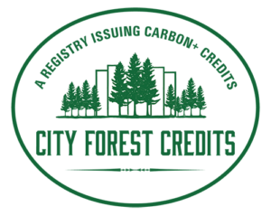
new logo


color palette
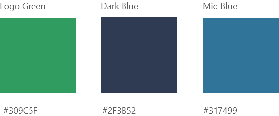
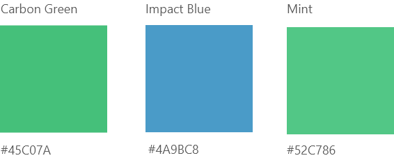
A primary green is the core color of the brand with blues incorporated to make the palette more complex. The lighter blue softens the overall and the mint offers a modern edge, often used on websites for startups.
core colors
program colors + call to action
custom illustrations
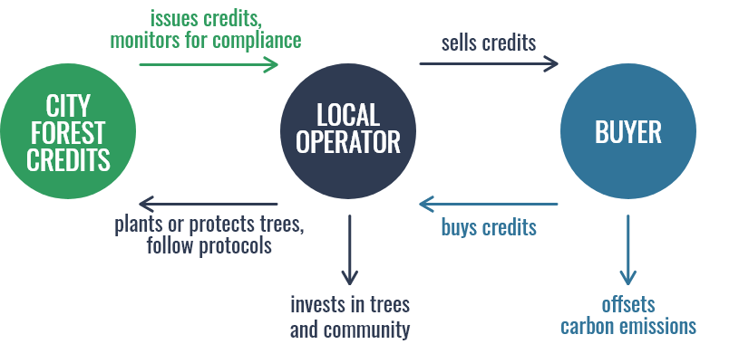
I designed icons for project cards and infographics to help break up CFC’s rather dense content and explain their complex model.
icons

service visualization
