background
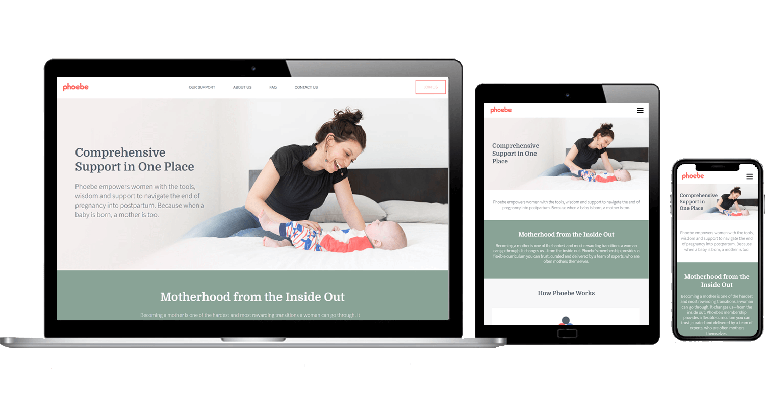
Phoebe is a NYC-based startup supporting women in late pregnancy and early postpartum.
We were just two weeks away from launching Phoebe’s new site when it became apparent that COVID would be a long-term disrupter to their business model. They were forced to pivot from in-person community and guidance to 100% virtual support. We quickly shifted messaging and added ecommerce so Phoebe could open membership to expecting moms across the country.
scope
- Competitive analysis
- User group development
- Personas + journey maps
- SEO strategy
- Wireframes + prototypes
- Usability testing
- Copywriting
- Web development
specs
- Custom WordPress site
- Built in 2020
It's been wonderful working with Carrie. Her expertise as a ux designer has deepened our understanding of Phoebe's audiences interests and needs. We've learned so much from the usability testing she's performed that's informed how to explain our complex product to prospective members. I appreciate how she's constantly looking for ways to improve our website.
—Emily Klingbeil, Co-Founder
highlights
limited user research
We had a small budget for user research but enough to develop personas and journey maps. These exercises helped answer unknowns about our target audiences and uncover potential pain points.
A few months after the site launched, we performed usability testing with pregnant women in their third trimester that dramatically increased our understanding of prospective members’ concerns and needs.
converting visitors to customers
One of Phoebe’s challenges is that their product has a high price point. It’s extremely competitive and more cost-effective than other products on the market, but many first-time pregnant women don’t know what they’ll need until they’ve had their baby.
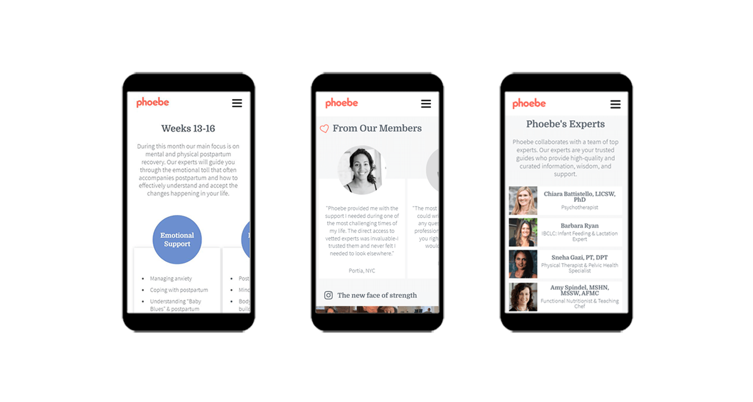
We sprinkled content-relevant testimonials throughout the website to provide social proof from members that Phoebe is worth the investment.
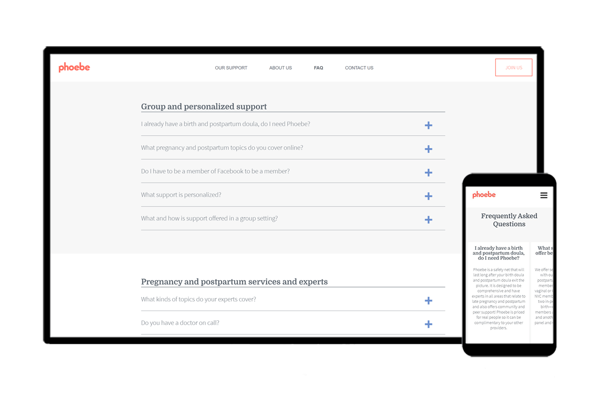
We also designed an extensive FAQ page, grouped by category to make it more user friendly, so visitors can quickly find answers to their questions. We also included swipeable FAQ cards on nearly every page to prompt visitors with answers to questions they may not even know they have.
optimized for mobile
As with most websites, mobile visitors account for over 50% of traffic, and even more—up to 90%—when Phoebe runs ad campaigns. We incorporated horizontal swiping and condensed many elements to save vertical space so visitors aren’t overwhelmed with information or feel like they’re on an endless scroll.
evolving needs + website
As Phoebe evolves, so does their website. I chose WooCommerce as our ecommerce platform to have flexibility to expand Phoebe’s product offerings. Since launching seven months ago, we’ve added a trial membership, subscriptions to allow for month-to-month memberships, and classes that members can register for online.
I am grateful to have Phoebe as an ongoing client to continue to optimize and adapt their website to the startup’s—and mom’s—evolving needs.
THE WEBSITE IS GORGEOUS! I can't stop looking at it! I keep going back to it and loving the clean lines and the images and the fact that you completely captured the warm but informative vibe of Phoebe so perfectly. Thanks for all of your imagination, patience, and guidance!
—Lucy Hutner, Co-Founder

