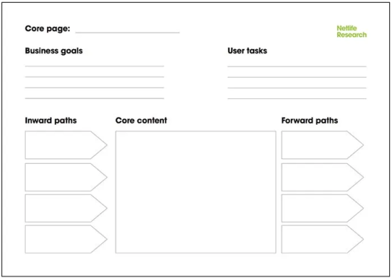
The core model is one of my favorite content design tools because it helps to focus content creation before writing a single sentence or designing a single element. Core modeling ensures that each page’s content meets both your business goals and your users’ needs. Plus, it helps you empathize with the visitor, prioritize information, increase engagement and conversion, and decrease homepage focus.
When to use the core model
I use the core model once I’ve finished user research and have created a sitemap. Whether I’m writing content for my clients or coaching them how to use the core model, we write copy for at least 50% of the site’s core pages before I feel comfortable beginning to think about design. Most clients are eager to dive into design, so I typically have to remind them of the importance of a content-first approach. Luckily, it’s not hard to get them on board!
Side note: A lot of new clients come to me seeking to improve a website they’ve redesigned within the last year. I’m shocked by how many web designers jump into wireframing and designing before they have copy…even some flashy, expensive agencies are guilty of this! I’m not going to lie—it makes me downright angry.
The og core model
I learned about the core model in a UX Design class in grad school (shout out to UW’s Comm Lead program and my instructor, Dave Holmberg) and immediately began using it for all my web design projects. Now, I find the core model so useful that I’ve adapted it to use with other communication tools like pitch decks, emails campaigns and print assets.
From what I’ve read, the information architect, Are Halland, introduced the core model to the world at the IA Summit in 2007. Ida Aalen shared this core model template in a super informative blog post on A List Apart. This is the model I first started working with.
Expanding the core model
Since I work with small nonprofits and businesses, most of my clients rarely have a single employee dedicated to communications (and not one of my 25+ clients have content strategists or UX designers on staff). Furthermore, we often don’t have the time or budget to do extensive user research. So I’ve built upon the OG core model to nudge my clients toward user-centered design—to begin thinking like content strategists.
These screenshots from a website redesign for Feather River Land Trust show the progression from core model > wireframe > website.
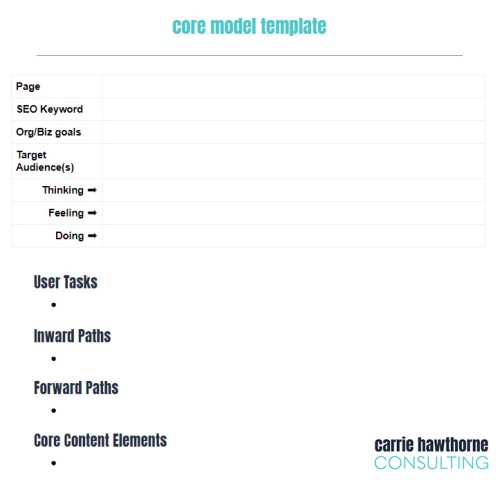
The core model template
I’ve created a template as a Google Doc that becomes the sole source of copy. I copy text from the core model and paste into wireframes, prototypes and eventually the content management system.
1. Page name
2. SEO keyword
To encourage an SEO-driven approach to our copy writing, I’ve added a field for the keyword. Sometimes it’s not the second field filled out, but including it helps guarantee the keyword is incorporated into the H1 heading and throughout the page’s copy. It also decreases the risk of duplicating keywords. (I typically use this spreadsheet for more in-depth SEO keyword management.)
3. Business/organizational goals
Why does this page exist? Is it to convince a customer to buy our product? Is it to convey our expertise? Whatever it may be, we want to be sure that everything on the page—from images to copy to calls to action (CTAs)—supports these goals.
4. Target audiences/user groups
Which of our user groups will be visiting this page? Aside from the homepage, not every user group will want or need to visit the page. For example, is it a page for long-time donors or someone who has never heard of you? Is it for pregnant women or women in postpartum? I tend to list out all groups I think will visit the page but focus on the most common/relevant groups.
5. Thinking/feeling/doing
A quick and dirty version of empathy mapping helps assess hierarchy of info along with elements, tone, headings, etc. The visitor may be wondering how your subscription works or how expensive your services are (thinking). She may be annoyed, anxious or excited (feeling). She may have 5 minutes on a bus during her commute or on a desktop at work with 5 other tabs open (doing). Typically I pick the primary audience for this activity because it can get tedious and might be an overkill to do it for more than one audience.
6. User tasks
What does the visitor need to accomplish on this page? Compile information for a boss, get a gift for a friend or determine if she can trust you? It may sound super basic but we need to make sure she can easily do this.
7. Inward paths
List the different sources users may have come from. The homepage, social media post, a google search, etc. This helps us think through context—do they know anything about us or are they completely new to our brand?
8. Forward paths
Where might they visit after this page and where do we want them to go? This info guides our offers, CTAs, exit-intent popups and more.
9. Core content
Now this is where the rubber hits the road—where we bring together everything we’ve thought through in the above 8 steps. If I’m doing the core model, I get as granular as including H1-H5 headings. If it’s my clients, they tend to just define headings, subheads, buttons, images, etc. Often I’ll start with an outline of the elements on the page and then I’ll go back in to fill them in with copy.
Incorporating the core model into your process
If you’re interested in using the core model, you can download a copy of the template I’ve created in Google docs. And of course, feel free to tweak my version to better suit your needs!


